
View The Case Study
View The Case Study
View The Case Study
Experience The Prototype
Experience The Prototype
Experience The Prototype

Process At A Glance
Deliverable
Menu and ordering app for The Kitchen Sink
Setting
Solo Project
Timeline
1 week
The Problem
Busy workers and commuters lack the time and/ or energy necessary to prepare a meal
The Solution
Design an app for The Kitchen Sink that allows users to easily order and pick up fresh, healthy dishes.
The Process
I like to start off my design projects with a small amount of research. I'll generally interview 3-5 individuals that match the target audience.
In this project I wanted to know
Why users would order out food?
What makes the process more convenient for them to order out?
and What features in a food ordering app make the process of ordering more enjoyable?
Based on the answers provided I developed two personas, and created user journey maps (See case study)
Once I had my personas, I conducted a competitive audit. I wanted to know what other restaurants were doing for their dedicated app, what the pain points were experienced in their user flow, and how I could improve The Kitchen Sink app to avoid those pain points. View Competitive Audit
After the competitive audit was completed, I started sketching wireframes. Instead of paper, I prefer to use my iPad for sketching wireframes in Goodnotes, as a way to maintain organization and have my sketches easily shareable.
"Paper " Wireframes
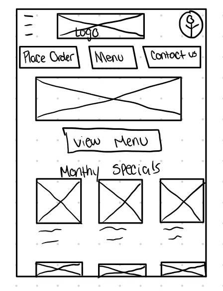
1
I noticed from the audit, that a lot of competitors didn't use photos to showcase dishes, or have obvious navigation buttons. I decided early on that I wanted to have a photo for every dish, and have clear cut buttons.
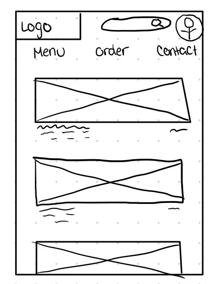
2
However, I was unsure of how I wanted to showcase each dish. Here, I was trying hero images for each dish- but I didn't like the feel.
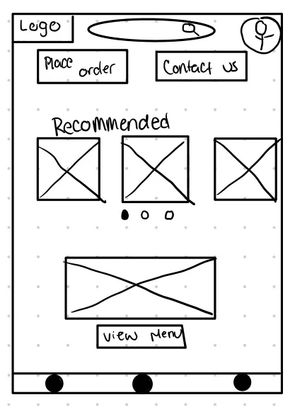
3
I liked the idea of a search bar, so I decided to try to incorporate it with the idea of a carousel with recommended food options.
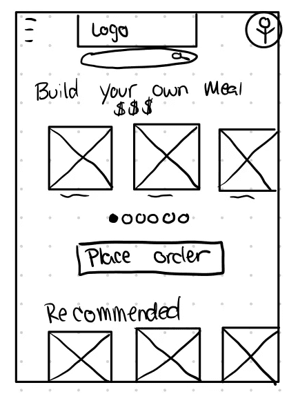
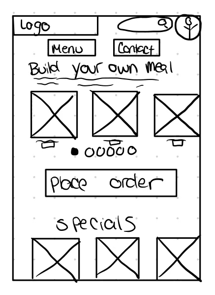
4
I liked the carousel, but I wanted something a bit more personalized for users. So I came up with a "Build Your Own Meal Deal" option to use in carousel format.
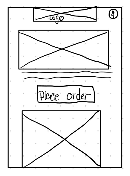
5
I didn't want to get too hung up on that concept though and wanted to see how a hero image with an order button would work out. Beneath it I had the idea to showcase dishes on a larger scale.
The Final Concept.
In the end, I liked certain parts from every wireframe and decided to put them together for the final version of my paper wireframe- this was the idea I decided to build from.
"Paper " Wireframes
1
I noticed from the audit, that a lot of competitors didn't use photos to showcase dishes, or have obvious navigation buttons. I decided early on that I wanted to have a photo for every dish, and have clear cut buttons.
2
However, I was unsure of how I wanted to showcase each dish. Here, I was trying hero images for each dish- but I didn't like the feel.
3
I liked the idea of a search bar, so I decided to try to incorporate it with the idea of a carousel with recommended food options.
4
I liked the carousel, but I wanted something a bit more personalized for users. So I came up with a "Build Your Own Meal Deal" option to use in carousel format.
5
I didn't want to get too hung up on that concept though and wanted to see how a hero image with an order button would work out. Beneath it I had the idea to showcase dishes on a larger scale.
The Final Concept.
In the end, I liked certain parts from every wireframe and decided to put them together for the final version of my paper wireframe- this was the idea I decided to build from.
Digital Wireframes
Digital Wireframes
Once I had my "paper" wireframes sketched, I started creating the digital format. I wanted to flesh out almost any aspect a user would flow through even if it wasn't browsing the menu and ordering.
Digital Wireframes
Once I had my "paper" wireframes sketched, I started creating the digital format. I wanted to flesh out almost any aspect a user would flow through even if it wasn't browsing the menu and ordering.


Low Fidelity Prototype.
Low Fidelity Prototype.
Low Fidelity Prototype.
After completing the Low-Fidelity, I noticed that my navigation headers and footers were severely cut off- and surprisingly, it didn't interfere with user flows asked in usability studies for the low fidelity prototype- However I decided in high fidelity I would fix those design issues.
After completing the Low-Fidelity, I noticed that my navigation headers and footers were severely cut off- and surprisingly, it didn't interfere with user flows asked in usability studies for the low fidelity prototype- However I decided in high fidelity I would fix those design issues.
After completing the Low-Fidelity, I noticed that my navigation headers and footers were severely cut off- and surprisingly, it didn't interfere with user flows asked in usability studies for the low fidelity prototype- However I decided in high fidelity I would fix those design issues.
High Fidelity Wireframes
High Fidelity Wireframes
High Fidelity Wireframes
After the usability study of the lo-fi prototype, I made design decisions. First the change the navigation header and footer, the second to remove the carousel in the "Build Your Own Meal Deal" despite the fact I liked it because some users in the study reported it was confusing on why the carousel was there if it didn't showcase all of the options.
After the usability study of the lo-fi prototype, I made design decisions. First the change the navigation header and footer, the second to remove the carousel in the "Build Your Own Meal Deal" despite the fact I liked it because some users in the study reported it was confusing on why the carousel was there if it didn't showcase all of the options.


High Fidelity Prototype.
High Fidelity Prototype.
High Fidelity Prototype.
I wanted this app to be somewhat colorful and lively- to reflect the colorful dishes The Kitchen Sink has to offer. Although this isn't the absolute final design (Because updates and new ideas), this is where I decided to end *for now*
I wanted this app to be somewhat colorful and lively- to reflect the colorful dishes The Kitchen Sink has to offer. Although this isn't the absolute final design (Because updates and new ideas), this is where I decided to end *for now*
I wanted this app to be somewhat colorful and lively- to reflect the colorful dishes The Kitchen Sink has to offer. Although this isn't the absolute final design (Because updates and new ideas), this is where I decided to end *for now*
The Nitty Gritty
That isn't at a glance.
For my usability study on the low fidelity prototype, I performed an "unmoderated" study. I invited participants into Discord, and asked them to complete prompts or tasks while they shared their screens- Showing me their interactions with the prototype. I didn't guide participants on how to complete a task- by doing that I was able to see how long it took them to find a particular button, or how long it would take them to complete the task.
Once I had my notes I was able to make an affinity diagram based on patterns. I personally do not like visual clutter (It stresses me out, and I can't think looking at it) So I condensed reoccurring issues into how many users reported them. I developed themes and insights to change in the high fidelity prototype.
View My Condensed Affinity Diagram.
With those insights I was able to design The Kitchen Sink app into the high fidelity prototype you've seen.
Takeaways
While in perfect world, things get done right the first time; We don't live in a perfect world… There were many iterations and changes done to low fidelity and high fidelity concepts.
This project taught me the value of a Design System that I refer to as a sticker sheet (because I'm a 90's kid and we loved sticker sheets). Specifically for the item pictures. While initially I was just creating each image on each frame from scratch. That's for the birds… Using a sticker sheet to create the images, prototype them out, and just duplicating and placing them to every page- TIME SAVER.
Thank You!
For taking the time to review my work.
If there's any room for improvement, please feel free to let me know, as I appreciate any opportunity to grow! (rhyme totally intended)
Contact
MKJ@Mikkyjayy.com
MikkyJayy@gmail.com
Craving to delve further?
Craving to delve further?
Craving to delve further?
Check out my other projects.
Pocket Chart- Design a dedicated mobile app and responsive website for a medical charting service.
The Drive By- Design a responsive website for a drive in move theater concession delivery service.
© 2023 Mikky Sanders
Powered by Jesus, Tears, & Coffee