
View The Case Study
View The Case Study
View The Case Study
Experience The Prototype
Experience The Prototype
Experience The Prototype

Process At A Glance
Deliverable
Responsive website for The Drive By's concession delivery service
Setting
Solo Project
Timeline
1 week
The Problem
Movie theater patrons would like a way to be able to receive snacks without going to the concession stand.
The Solution
Design a responsive website for The Drive By that allows users to order concessions for delivery to their vehicle.
The Process
I like to start off my design projects with a small amount of research. I'll generally interview 3-5 individuals that match the target audience.
In this project I wanted to know
Why are users hesitant to get up mid-movie to refill concessions?
and What would make the concession retrieval process easier?
Based on the answers provided I developed two personas, and created user journey maps (See case study)
Once I had my personas, I conducted a competitive audit. Due to The Drive By being one of 177 drive in movie theaters left in the United States it was rather easy to tell that out of the 46 drive in theaters based on the eastern coast with The Drive By- none of them offered concession delivery.
After the competitive audit was completed, I started sketching wireframes. Instead of paper, I prefer to use my iPad for sketching wireframes in Goodnotes, as a way to maintain organization and have my sketches easily shareable.
For this responsive web design, I decide early on I wanted to imagine if the internet was alive during the 60's- what would a website look like?
If it were alive during the 60's it would have been *extremely* simple, but I wanted some modern aspect to the design.
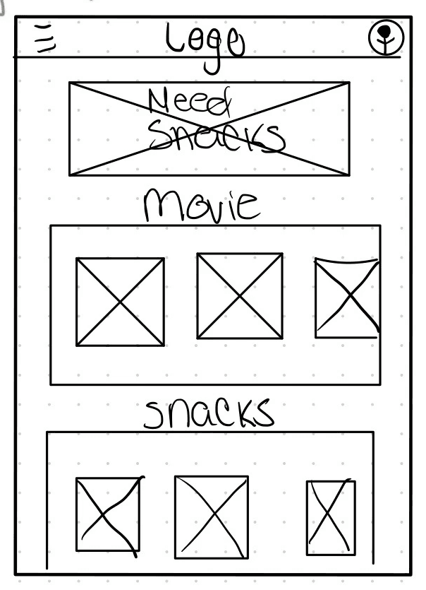
"Paper " Wireframes
1
I noticed from the audit, that a lot of competitors didn't use photos to showcase dishes, or have obvious navigation buttons. I decided early on that I wanted to have a photo for every dish, and have clear cut buttons.
2
However, I was unsure of how I wanted to showcase each dish. Here, I was trying hero images for each dish- but I didn't like the feel.
3
I liked the idea of a search bar, so I decided to try to incorporate it with the idea of a carousel with recommended food options.
4
I liked the carousel, but I wanted something a bit more personalized for users. So I came up with a "Build Your Own Meal Deal" option to use in carousel format.
5
I didn't want to get too hung up on that concept though and wanted to see how a hero image with an order button would work out. Beneath it I had the idea to showcase dishes on a larger scale.
The Final Concept.
In the end, I liked certain parts from every wireframe and decided to put them together for the final version of my paper wireframe- this was the idea I decided to build from.
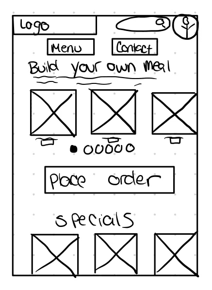
"Paper " Mobile Wireframes
"Paper " Mobile Wireframes
1
I noticed from the audit, that most competitors focused their website around movies alone. However, I wanted to showcase both movies and snacks given the fact that movie theaters make their money off of concessions- not movie ticket sales.
2
I wanted to experiment with a Z form layout with cards displaying movies, and concessions. However I didn't quite like the amount of negative space there was.
3
I decided to experiment with a hero image advertising the concession delivery service, as well as putting cards for movies, about me, events, and snacks. However this felt extremely cluttered to me, and I felt on mobile would be extremely overwhelming.
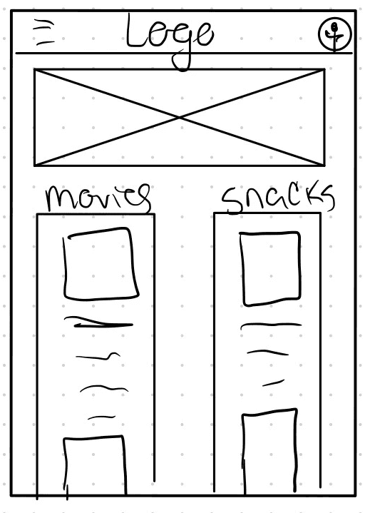
4
I thought the hero image was a nice touch, so I decided to experiment with movie and concession information in single column rows for each.
The Final Concept
In the end, I decided to use the hero image and stacked cards for movies and snacks.
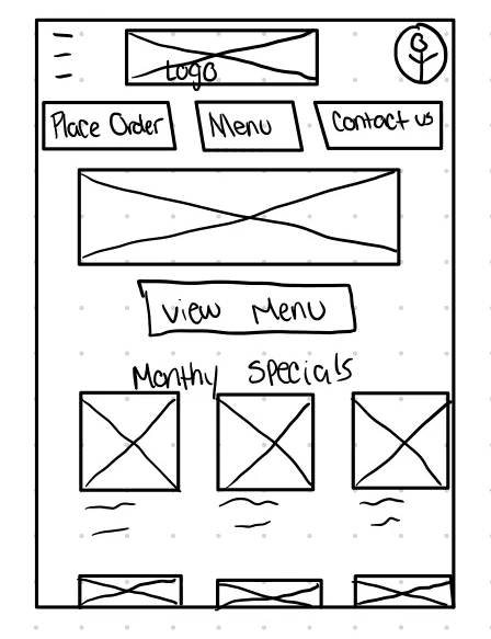
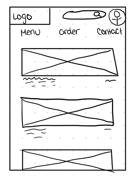
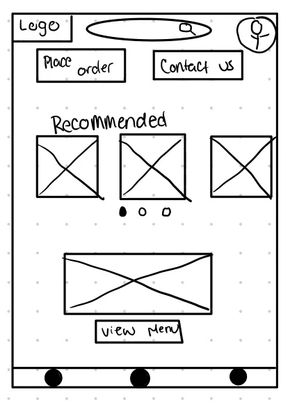
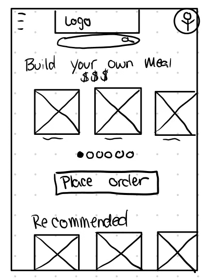
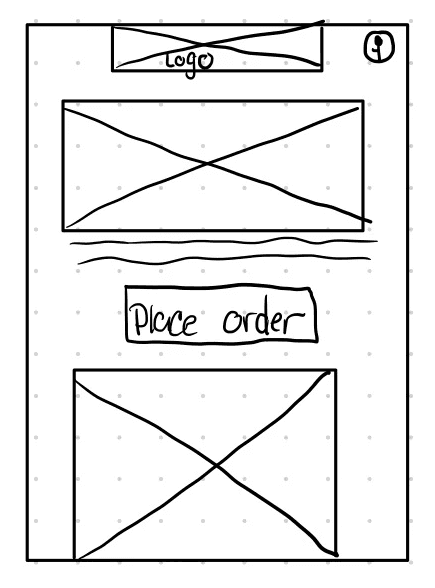
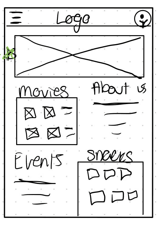
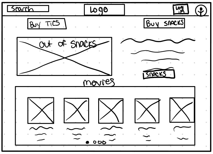
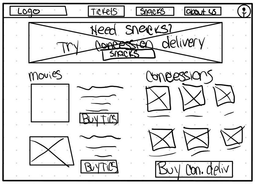
"Paper " Desktop Wireframes
"Paper " Desktop Wireframes
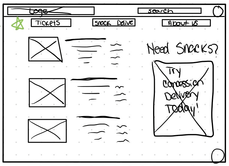
1
Here I wanted to showcase movies on the left with a hero image add of concession delivery on the right, However I didn't like the lack of concession showcasing.
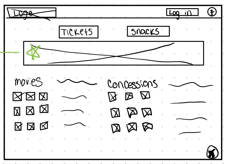
2
I decided to showcase movies and concessions as well as have a hero image, but I also wanted buttons that led to buying tickets and browsing the menu in totality.
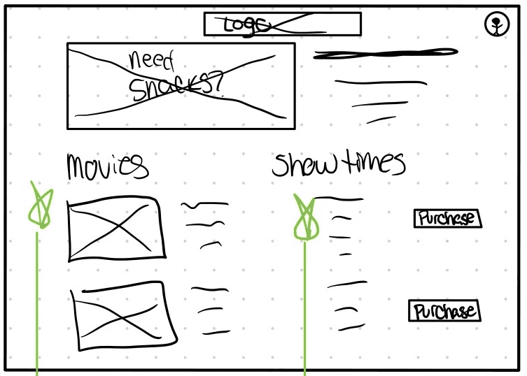
3
Here I was experimenting with a hero image on the left with a description on the right and a column style layout for movies and showtimes- However because the drive in theater has one show time for two screens it didn't feel necessary to go with this layout.
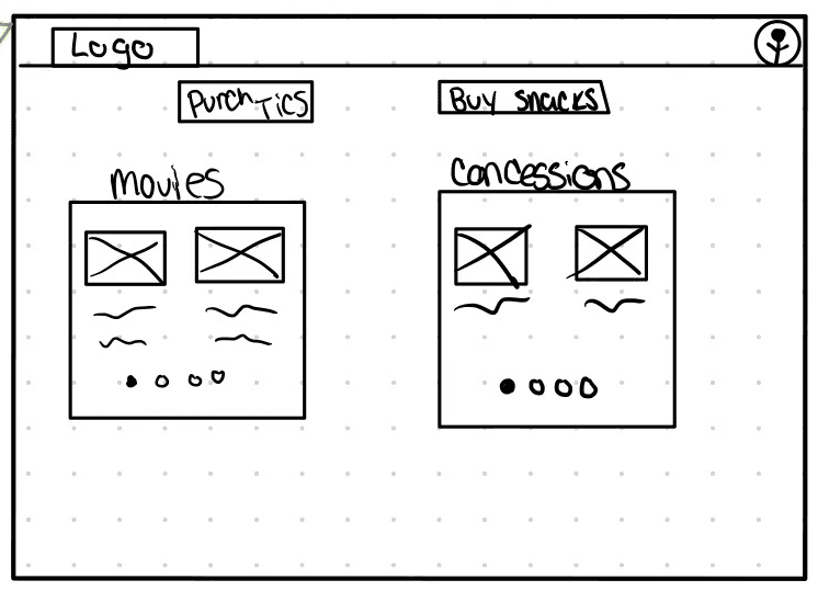
4
I wanted to see how the desktop wireframe would feel with a more simplified approach with two cards and carousels showcasing the movies and concession options.
5
I liked the idea of carousel cards, but I didn't like how empty option 4 felt, So I decided to try out the hero image of concession options and a description.
The Final Concept.
In my final concept I decided to do a hero image, movie cards on one side and concession card on the other. In the end while designing I decided to design the concessions into a carousel card.
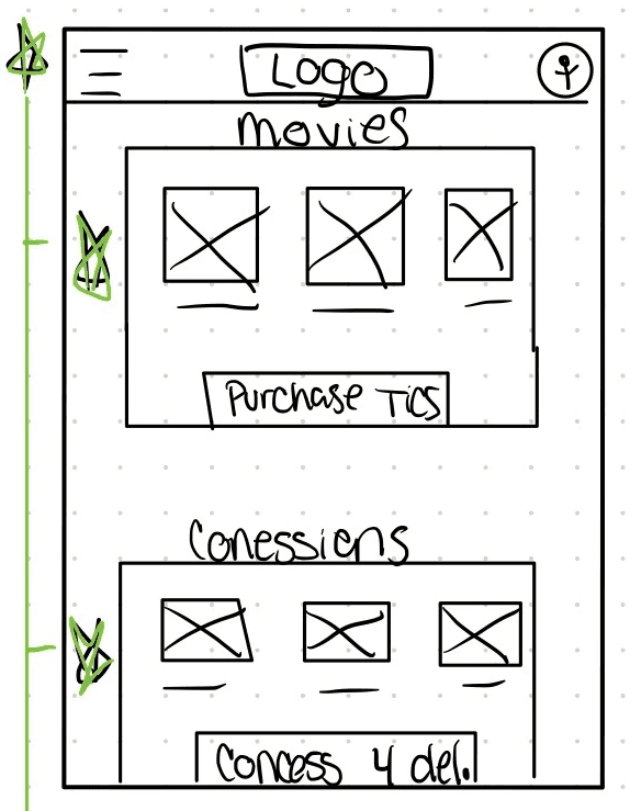
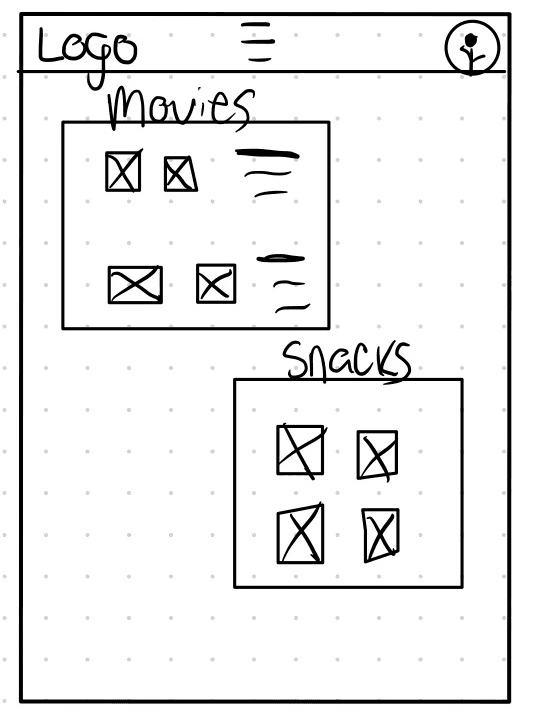
Digital Wireframes
Digital Wireframes
Digital Wireframes
Once I had a rough idea of the direction I wanted to go in, I started working on my mobile lo-fi wireframes first. I felt that even though I wanted the focus to be on snacks (because that's how theaters make money) the main reason people look at movie theater websites is to see what's playing- so that information should be above the fold.
Once I had a rough idea of the direction I wanted to go in, I started working on my mobile lo-fi wireframes first. I felt that even though I wanted the focus to be on snacks (because that's how theaters make money) the main reason people look at movie theater websites is to see what's playing- so that information should be above the fold.


Low Fidelity Prototype.
Low Fidelity Prototype.
Low Fidelity Prototype.
Here you see the mobile prototype, however during usability studies I decided to use the iPad prototype for usability studies to give users a larger screen to experience without using desktop. On desktop everything was above the fold, however I wanted to see how users would perform with information under the fold as most users ordering delivery service would be using a mobile device of some sort.
Here you see the mobile prototype, however during usability studies I decided to use the iPad prototype for usability studies to give users a larger screen to experience without using desktop. On desktop everything was above the fold, however I wanted to see how users would perform with information under the fold as most users ordering delivery service would be using a mobile device of some sort.
Here you see the mobile prototype, however during usability studies I decided to use the iPad prototype for usability studies to give users a larger screen to experience without using desktop. On desktop everything was above the fold, however I wanted to see how users would perform with information under the fold as most users ordering delivery service would be using a mobile device of some sort.
High Fidelity Wireframes
High Fidelity Wireframes
High Fidelity Wireframes
After the usability study of the lo-fi prototype, I decided to start fleshing out the Hi-fi wireframes. Here you see the iPad version of the wireframes created.
After the usability study of the lo-fi prototype, I decided to start fleshing out the Hi-fi wireframes. Here you see the iPad version of the wireframes created.


High Fidelity Prototype.
High Fidelity Prototype.
High Fidelity Prototype.
I wanted this responsive design to reflect a simplistic 60's feel. Although the 60's didn't have internet I wanted to design this with the idea if the 60's had internet- how would this website look?
I wanted this responsive design to reflect a simplistic 60's feel. Although the 60's didn't have internet I wanted to design this with the idea if the 60's had internet- how would this website look?
I wanted this responsive design to reflect a simplistic 60's feel. Although the 60's didn't have internet I wanted to design this with the idea if the 60's had internet- how would this website look?
The Nitty Gritty
That isn't at a glance.
For my usability study on the low fidelity prototype, I performed an "unmoderated" study. I invited participants into Discord, and asked them to complete prompts or tasks while they shared their screens- Showing me their interactions with the prototype. I didn't guide participants on how to complete a task- by doing that I was able to see how long it took them to find a particular button, or how long it would take them to complete the task.
Once I had my notes I was able to make an affinity diagram however, the only patterns that were consistent (users having difficulty deciding whether to choose 'order delivery' or 'buy snacks' option to view the menu) honestly didn't matter which option users chose to go with because both options led to the menu and through either option users could order concessions for delivery. I didn't feel the need to remove one of the options. The other pattern that was presented was users felt the site was overly simple- but due to it being lo-fi and keeping the design decision in mind I didn't decide to make any major design changes.
With those insights I was able to design The Drive By's responsive website into the high fidelity design you've seen today.
Takeaways
Honestly, this project taught me how to step outside of my comfort zone, and push past self doubt. I honestly wanted to do so much more with this design, however keeping the 60's in mind as if this site was designed in the 60's I felt limited in making too complicated designs or animations. So many times I wanted to bin the work I had done, and start new- throwing out the concept of "65 years of tradition."
However, I decided to persevere and in the end I feel like it ended up being a cute project.
Thank You!
For taking the time to review my work.
If there's any room for improvement, please feel free to let me know, as I appreciate any opportunity to grow! (rhyme totally intended)
Contact
MKJ@Mikkyjayy.com
MikkyJayy@gmail.com
Wanna See More?
Wanna See More?
Wanna See More?
Check out my other projects.
Pocket Chart- Design a dedicated mobile app and responsive website for a medical charting service.
The Kitchen Sink- Design a menu and ordering app for a family diner.
© 2023 Mikky Sanders
Powered by Jesus, Tears, & Coffee