
View The Case Study
View The Case Study
View The Case Study
Experience The Prototype
Experience The Prototype
Experience The Prototype

Process At A Glance
Deliverable
Dedicated mobile app and responsive website for Mcleod Medical's pocket chart, a personal medical charting service.
Setting
Solo Project
Timeline
1 week
The Problem
Patients and their loved ones want a way to document health problems or concerns and have the ability to find them with ease when consulting with medical professionals.
The Solution
Design a dedicated mobile app and responsive website for Pocket Chart- Mcleod Medical's medical diary consisting of patient/ loved one entries, medical history such as medications, doctors, diagnosis, & more.
The Process
I like to start off my design projects with a small amount of research. I'll generally interview 3-5 individuals that match the target audience.
In this project I wanted to know
What is the issue with their current way of documenting health history?
What would make the documenting process easiest? and What kind of information would users like documented?
Based on the answers provided I developed two personas, and created user journey maps (See case study)
Once I had my personas, while I wanted to conduct a competitive audit of patient portals- unfortunately, patient portals are limited to patients of medical establishments, while I am only a patient at one medical establishment- they do not offer patient portal access. However my insurance- Tricare offers a patient portal type experience. Tricare website navigation is- a nightmare at best. It's difficult to access any information as it is spread across multiple entities. However if you have the time, in a matter of 30 minutes to an hour you can access your vaccination history, medical visit charts, diagnosis, and doctor information. While it was similar to what I was designing for Mcleod's pocket chart, it missed the mark in being a direct competitor.
After the competitive audit was completed, I started sketching wireframes. Instead of paper, I prefer to use my iPad for sketching wireframes in Goodnotes, as a way to maintain organization and have my sketches easily shareable.
"Paper " Wireframes
1
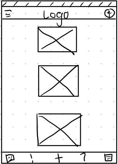
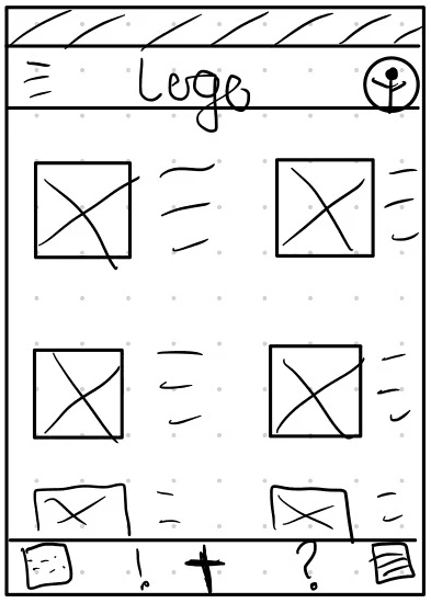
I knew initially I wanted a way for users to see their entries and images/ videos associated with each entry, I liked this style but I wasn't sure if I wanted to commit to it.
2
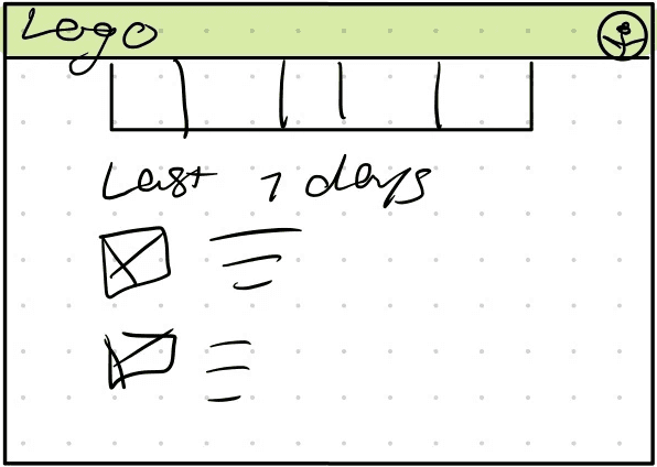
I wanted to experiment with what it would look like to have entries in card format showing images associated with each entry but I didn't feel that enough information was present in regards to date and issue documented.
3
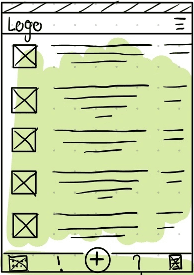
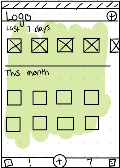
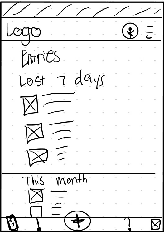
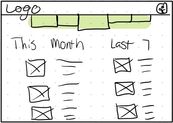
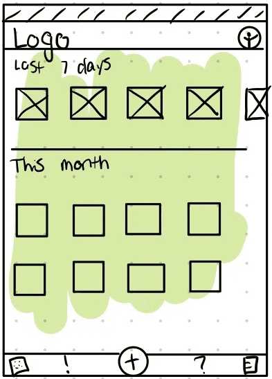
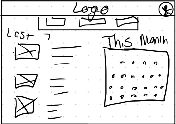
I decided to try separating entry cards by most recent- 'Last 7 days' of entries and 'This Month' so users would be able to find entries a bit easier, but it still didn't feel like enough information.
4
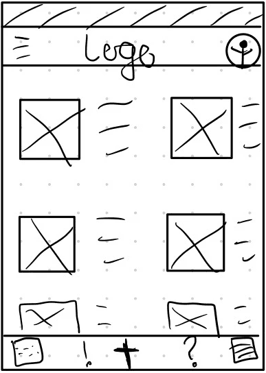
So I wanted to experiment with what it would look like to have cards and information listed.
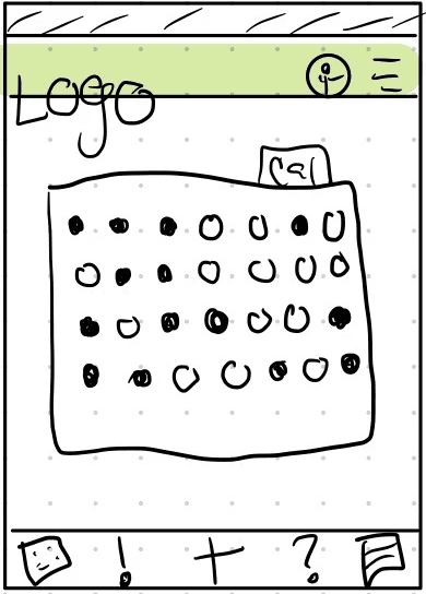
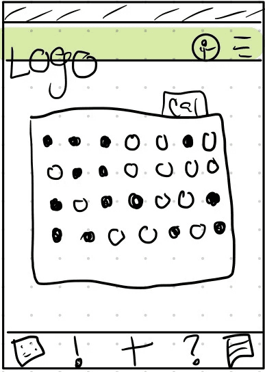
5
Here I was experimenting with a calendar view with no cards or information, but a calendar showing when entries were logged. I liked this initially and decided that it wasn't enough information for users to easily access their entries.
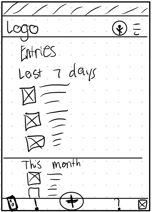
The Final Concept.
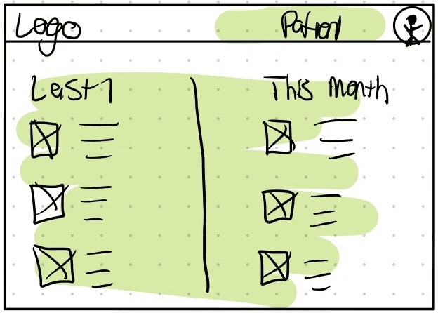
In the end I decided to combine the last 7 days, and this month view with cards and information so users could easily access entries logged.
"Paper " Wireframes
1
Once I had my dedicated mobile app outlined, I wanted a similar feel on the desktop version, but I wasn't sure on how I wanted the information laid out.
2
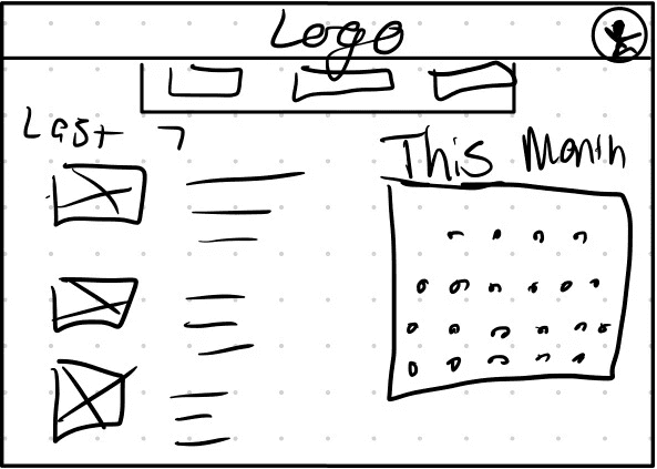
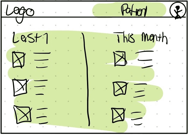
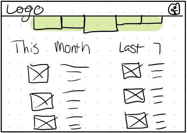
I wanted to see if on the desktop version a card listing of the last 7 days and a calendar view to document the current month of entries would be a way to organize entries on the homepage.
3
Here I had the idea to make large navigation buttons for vision impaired users, and rather like the idea.
4
Like the mobile version, I rather liked the idea of having cards from the last 7 days and entries from the current month. I decided to try out a two column layout.
The Final Concept
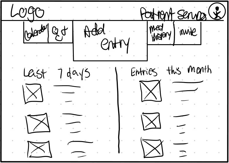
For this wireframe I decided to combine multiple aspects from different frames to create this concept for desktop I would build from.
"Paper " Mobile Wireframes
"Paper " Mobile Wireframes
1
I knew initially I wanted a way for users to see their entries and images/ videos associated with each entry, I liked this style but I wasn't sure if I wanted to commit to it.

2
I wanted to experiment with what it would look like to have entries in card format showing images associated with each entry but I didn't feel that enough information was present in regards to date and issue documented.
3
I decided to try separating entry cards by most recent- 'Last 7 days' of entries and 'This Month' so users would be able to find entries a bit easier, but it still didn't feel like enough information.
4
So I wanted to experiment with what it would look like to have cards and information listed.
5
Here I was experimenting with a calendar view with no cards or information, but a calendar showing when entries were logged. I liked this initially and decided that it wasn't enough information for users to easily access their entries.
The Final Concept.
In the end I decided to combine the last 7 days, and this month view with cards and information so users could easily access entries logged.
"Paper " Desktop Wireframes
"Paper " Desktop Wireframes
1
Once I had my dedicated mobile app outlined, I wanted a similar feel on the desktop version, but I wasn't sure on how I wanted the information laid out.
2
I wanted to see if on the desktop version a card listing of the last 7 days and a calendar view to document the current month of entries would be a way to organize entries on the homepage.
3
Here I had the idea to make large navigation buttons for vision impaired users, and rather like the idea.
4
Like the mobile version, I rather liked the idea of having cards from the last 7 days and entries from the current month. I decided to try out a two column layout.

The Final Concept
For this wireframe I decided to combine multiple aspects from different frames to create this concept for desktop I would build from.
Digital Wireframes
Digital Wireframes
Digital Wireframes
After sketching what I wanted my frames to look like I started designing my mobile wireframes first. I wanted to flesh out almost any aspect and feature that I might want in high fidelity.


Low Fidelity Prototype.
Low Fidelity Prototype.
Low Fidelity Prototype.
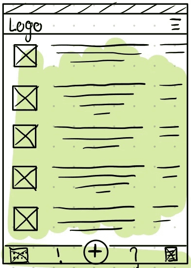
From usability studies with this prototype I was able to glean a lot of knowledge on how to improve this prototype. For example the navigation footer, I initially thought it was intuitive for adding an entry to be the plus button in the center of the navigation footer, however I very quickly discovered it wasn't as intuitive as I initially thought which led to a total redesign of the navigation.
From usability studies with this prototype I was able to glean a lot of knowledge on how to improve this prototype. For example the navigation footer, I initially thought it was intuitive for adding an entry to be the plus button in the center of the navigation footer, however I very quickly discovered it wasn't as intuitive as I initially thought which led to a total redesign of the navigation.
From usability studies with this prototype I was able to glean a lot of knowledge on how to improve this prototype. For example the navigation footer, I initially thought it was intuitive for adding an entry to be the plus button in the center of the navigation footer, however I very quickly discovered it wasn't as intuitive as I initially thought which led to a total redesign of the navigation.
High Fidelity Wireframes
High Fidelity Wireframes
High Fidelity Wireframes
Once I had feedback on the mobile app portion of this project I started creating high fidelity wireframes, here you can partially see the redesign of the navigation footer.
Once I had feedback on the mobile app portion of this project I started creating high fidelity wireframes, here you can partially see the redesign of the navigation footer.
Once I had feedback on the mobile app portion of this project I started creating high fidelity wireframes, here you can partially see the redesign of the navigation footer.
Once I had feedback on the mobile app portion of this project I started creating high fidelity wireframes, here you can partially see the redesign of the navigation footer.


High Fidelity Mobile Prototype.
High Fidelity Mobile Prototype.
High Fidelity Mobile Prototype.
Due to users being concerned with security in usability studies, I decided to up the ante with security and privacy in mind for the high fidelity prototype. Log in pages, drop down sections in the medical chart, and inviting loved ones or caregivers to have access to document and see documentation.
Due to users being concerned with security in usability studies, I decided to up the ante with security and privacy in mind for the high fidelity prototype. Log in pages, drop down sections in the medical chart, and inviting loved ones or caregivers to have access to document and see documentation.
Due to users being concerned with security in usability studies, I decided to up the ante with security and privacy in mind for the high fidelity prototype. Log in pages, drop down sections in the medical chart, and inviting loved ones or caregivers to have access to document and see documentation.
High Fidelity Desktop Prototype.
High Fidelity Desktop Prototype.
High Fidelity Desktop Prototype.
Due to the desktop version being accessed through the hospital website there was a slightly different approach to how users would access the patient portal.
Due to the desktop version being accessed through the hospital website there was a slightly different approach to how users would access the patient portal.
The Nitty Gritty
That isn't at a glance.
For my usability study on the low fidelity prototype, I performed an "unmoderated" study. I invited participants into Discord, and asked them to complete prompts or tasks while they shared their screens- Showing me their interactions with the prototype. I didn't guide participants on how to complete a task- by doing that I was able to see how long it took them to find a particular button, or how long it would take them to complete the task.
Once I had my notes I was able to make an affinity diagram based on patterns. I personally do not like visual clutter (It stresses me out, and I can't think looking at it) So I condensed reoccurring issues into how many users reported them. I developed themes and insights for things to change in the high fidelity prototype.
Takeaways
This design was a curveball, I felt I had to reinvent the wheel to come up with a different approach on designing the navigation footer, and although that was extremely daunting at first, I went with my gut and feel I came up with a better design. I also taught myself how to make interactive text inputs for the log in screens to give usability study participants a true feeling of security taken into account. Overall I'm very proud of all aspects of this design from mobile to desktop.
Thank You!
For taking the time to review my work.
If there's any room for improvement, please feel free to let me know, as I appreciate any opportunity to grow! (rhyme totally intended)
Contact
MKJ@Mikkyjayy.com
MikkyJayy@gmail.com
Wish to plunge further into my work?
Wish to plunge further into my work?
Wish to plunge further into my work?
Check out my
Personal Projects- The things that keep me learning.
The Kitchen Sink- Design a menu and ordering app for a family diner.
© 2023 Mikky Sanders
Powered by Jesus, Tears, & Coffee